


Sneha Mahadev Lonare
Excellent
 (57 reviews)
 4 Lessons
 21 Students
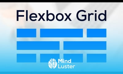
Cómo hacer sitios web responsive con flexbox, te enseña paso a paso cómo diseñar páginas web modernas, flexibles y adaptables a cualquier dispositivo utilizando las propiedades del modelo CSS Flexbox. Aprenderás a crear estructuras dinámicas que se ajustan automáticamente al tamaño de la pantalla, dominando conceptos como contenedores flexibles, alineación, justificación, direcciones y distribución de elementos. También descubrirás cómo combinar Flexbox con media queries para lograr un diseño completamente responsivo sin necesidad de frameworks externos. A través de ejercicios prácticos, aprenderás a construir encabezados, menús, galerías y secciones fluidas que se adaptan perfectamente a móviles, tablets y computadoras. Al finalizar, podrás crear sitios web profesionales, bien organizados y totalmente responsivos. FalconMasters
 To Register in Course you have to watch at least 30 Second of any lesson
 Create responsive web layouts using CSS Flexbox for mobile, tablet, and desktop devices
Design flexible, adaptable website structures with Flexbox properties like alignment, justification, and distribution
Combine Flexbox with media queries to develop fully responsive websites without external frameworks
Build professional, well-organized web pages including headers, menus, galleries, and fluid sections
4 Lessons • 1 h 8 m total
 You must have an
Account
on the platform.
Complete all lessons.
Watch at least 50% of Lesson Duration.
Get your Certificate free 🎉 !
4.1
(57 reviews)
Overall rating

Be the First One Review This Course
Excellent

Cómo hacer sitios web responsive con flexbox, te enseña paso a paso cómo diseñar páginas web modernas, flexibles y adaptables a cualquier dispositivo utilizando las propiedades del modelo CSS Flexbox. Aprenderás a crear estructuras dinámicas que se ajustan automáticamente al tamaño de la pantalla, dominando conceptos como contenedores flexibles, alineación, justificación, direcciones y distribución de elementos. También descubrirás cómo combinar Flexbox con media queries para lograr un diseño completamente responsivo sin necesidad de frameworks externos. A través de ejercicios prácticos, aprenderás a construir encabezados, menús, galerías y secciones fluidas que se adaptan perfectamente a móviles, tablets y computadoras. Al finalizar, podrás crear sitios web profesionales, bien organizados y totalmente responsivos. FalconMasters
Experience the full power of Mindluster with Premium.
No distractions, just pure education.
Cancel your subscription anytime