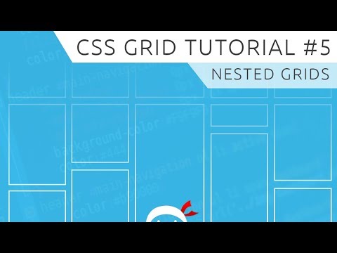
CSS Grid Tutorial 5 Nested Grids
Share your inquiries now with community members
Click Here
Sign up Now
Lessons List | 10
Lesson
Comments
Our New Certified Courses Will Reach You in Our Telegram Channel
Join Our Telegram Channels to Get Best Free Courses
Join Now
We Appreciate Your Feedback
17 Reviews

M.Dhivyadharshini

egbe sampson
Shraddha Chandrakant Lahare

santhosh kumar
Show More Reviews
Related Courses in Programming


Course Description
CSS Grid Layout excels at dividing a page into major regions or defining the relationship in terms of size, position, and layer, between parts of a control built from HTML primitives. Like tables, grid layout enables an author to align elements into columns and rows.How to Create a CSS Grid Step-by-Step
Set Up the Grid Container and the Grid Items. A CSS Grid consists of horizontal and vertical grid tracks (rows and columns). ...
Add Gutters. The grid-gap property is a shorthand for grid-row-gap and grid-column-gap. ...
Position Grid Cells. ...
Size Grid Cells. ...
Define Named Grid Areas. ...
Create Nested Grids.CSS grid is better when:
We can define the gap between our rows or columns very easily, without having to use the margin property, which can cause some side effects especially if we're working with many breakpoints.You can turn on the grid button located in the div which has display: grid declared. All you have to do is go to your browser's developer tools (mine is Microsoft Edge which is based on Chromium). You will see a button like this. And then you can code and test as you wish.CSS Grid vs. Bootstrap. ... If you're layout-first, meaning you want to create the layout and then place items into it, then you'll be better off with CSS Grid. But if you're content-first, meaning you have items that you want to place into a container and space out evenly, then go with Bootstrap.
Trends
French
Graphic design tools for beginners
Data Science and Data Preparation
Artificial intelligence essentials
Formation efficace à l écoute de l
Learning English Speaking
Essential english phrasal verbs
MS Excel
Electrical engineering for engineer
American english speaking practice
Build a profitable trading
Build a tic tac Toe app in Xcode
Python for beginners
Figma for UX UI design
YouTube channel setup
Marketing basics for beginners
Web Design for Beginners
Computer science careers
ArrayLists in C for beginners
Magento Formation Français
Recent
Data Science and Data Preparation
Growing ginger at home
Gardening basics
Ancient watering techniques
Grow mushrooms
Growing onions
Veggie growing
Bean growing at home
Growing radishes
Tomato growing at home
Shallot growing
Growing kale in plastic bottles
Recycling plastic barrel
Recycling plastic bottles
Grow portulaca grandiflora flower
Growing vegetables
Growing lemon tree
Eggplant eggplants at home
zucchini farming
watermelon farming in pallets