×
MindLuster Logo

Adding chart elements in excel for beginners

Track :

Computer Softwares

Lessons no : 11

For Free Certificate After Complete The Course

To Register in Course you have to watch at least 30 Second of any lesson

Join The Course Go To Community Download Course Content

What will you learn in this course?
  • Add and customize chart titles, axis labels, and data labels to improve chart clarity and data communication
  • Incorporate gridlines, legends, and trendlines to enhance data visualization and highlight key insights
  • Use the "Chart Design" tab to efficiently add and modify chart elements for professional data presentations
  • Adjust fonts, colors, and positions of chart elements to match specific reporting and branding requirements
  • Create visually appealing and informative charts by strategically placing and formatting chart elements
  • Apply practical techniques to highlight important data points and trends within Excel charts
  • Enhance data storytelling by effectively integrating chart titles, labels, and trendlines for better audience understanding
  • Develop skills to transform basic charts into impactful visual tools for data analysis and reporting

How to Get The Certificate

  • You must have an account Register
  • Watch All Lessons
  • Watch at least 50% of Lesson Duration
  • you can follow your course progress From Your Profile
  • You can Register With Any Course For Free
  • The Certificate is free !
Lessons | 11


We Appreciate Your Feedback

Be the First One Review This Course

Excellent
0 Reviews
Good
0 Reviews
medium
0 Reviews
Acceptable
0 Reviews
Not Good
0 Reviews
0
0 Reviews

Our New Certified Courses Will Reach You in Our Telegram Channel
Join Our Telegram Channels to Get Best Free Courses

Join Now

Related Courses

Adding chart elements in excel course, 
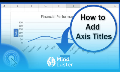
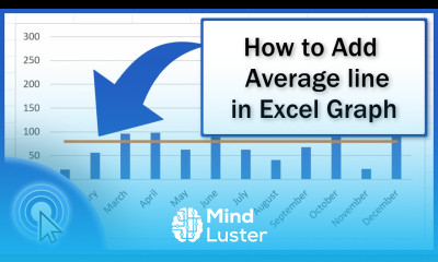
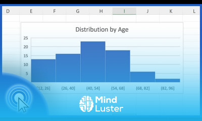
in this course we will learn about adding chart elements in Excel, a crucial skill for enhancing the clarity and visual appeal of your data presentations. Adding and customizing chart elements can transform basic charts into powerful tools for data analysis and communication. We will start by creating a basic chart from a dataset, then delve into the various chart elements that can be added to improve your chart's readability and impact. These elements include chart titles, axis titles, data labels, gridlines, legends, and trendlines. You will learn how to add these elements using the "Chart Design" tab and how to customize them to fit your specific needs, such as adjusting fonts, colors, and positions. Hands-on exercises will provide practical experience in applying these techniques, ensuring you can effectively use chart elements to highlight key data points and trends. By the end of this course, you will be proficient in enhancing your Excel charts with well-placed and informative elements, making your data presentations more professional and impactful. Whether you are a beginner or looking to refine your skills, this course will equip you with the knowledge and tools to master adding chart elements in Excel, improving your data visualization and communication capabilities.