×
MindLuster Logo
Join Our Telegram Channel Now to Get Any New Free Courses : Click Here

Chart types in excel for beginners

Track :

Computer Softwares

Lessons no : 161

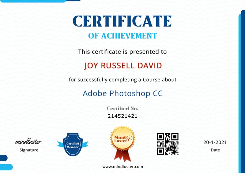
For Free Certificate After Complete The Course

To Register in Course you have to watch at least 30 Second of any lesson

Join The Course Go To Community Download Course Content

What will you learn in this course?
  • Create and customize basic Excel charts including bar, line, and pie charts for effective data visualization
  • Select appropriate chart types such as scatter plots, histograms, and bubble charts for diverse data sets
  • Apply formatting and design elements to enhance the clarity and visual appeal of Excel charts
  • Interpret data insights accurately using various chart types to support decision-making processes
  • Utilize Excel chart tools to highlight trends, patterns, and outliers in complex datasets
  • Implement best practices for data presentation to communicate information clearly and professionally
  • Troubleshoot common issues in chart creation and formatting within Excel environments
  • Integrate charts into reports and presentations to improve data storytelling and stakeholder engagement
  • Compare different chart types to determine the most effective visualization for specific data scenarios
  • Use advanced chart features like data labels, trendlines, and axes customization in Excel
  • Design visually compelling charts that adhere to data visualization principles and standards
  • Leverage Excel chart templates and styles to streamline the chart creation process
  • Analyze large datasets using scatter plots and histograms for detailed data analysis
  • Create dynamic and interactive charts using Excel's charting tools for real-time data updates
  • Apply data visualization best practices to improve the impact and readability of Excel charts
  • Develop skills to communicate complex data insights through effective chart design and customization

How to Get The Certificate

  • You must have an account Register
  • Watch All Lessons
  • Watch at least 50% of Lesson Duration
  • you can follow your course progress From Your Profile
  • You can Register With Any Course For Free
  • The Certificate is free !
Lessons | 161
Show More Lessons


We Appreciate Your Feedback

Be the First One Review This Course

Excellent
0 Reviews
Good
0 Reviews
medium
0 Reviews
Acceptable
0 Reviews
Not Good
0 Reviews
0
0 Reviews

Our New Certified Courses Will Reach You in Our Telegram Channel
Join Our Telegram Channels to Get Best Free Courses

Join Now

Related Courses

Chart types in excel course, in this course we will explore the diverse range of chart types available in Excel, empowering you to effectively visualize and interpret your data. We will start with the basics, introducing you to common chart types such as bar charts, line charts, and pie charts. You’ll learn how to select the appropriate chart type for different data sets, ensuring your visualizations communicate the intended message clearly. The course will cover advanced chart types, including scatter plots, bubble charts, and histograms, as well as how to customize these charts with various formatting options and design elements. Through practical examples and hands-on exercises, you’ll gain the skills needed to create compelling and insightful charts. By the end of this course, you'll be proficient in using Excel's charting tools to enhance your data analysis and presentation capabilities. Whether you’re a beginner or looking to refine your skills, this course offers valuable insights and practical tips to elevate your Excel proficiency. Join us to master the art of data visualization with Excel's chart types.