×
MindLuster Logo

Pivot charts in excel for beginners

Track :

Computer Softwares

Lessons no : 12

For Free Certificate After Complete The Course

To Register in Course you have to watch at least 30 Second of any lesson

Join The Course Go To Community Download Course Content

What will you learn in this course?
  • Create and format Pivot Charts in Excel to visualize data effectively for insights and presentations
  • Apply filters, slicers, and drill-down features to manipulate Pivot Chart data dynamically in Excel
  • Customize various types of Pivot Charts, including bar, line, and pie charts, for specific analytical needs
  • Convert Pivot Tables into interactive Pivot Charts to identify patterns, trends, and key data insights
  • Enhance data visualization skills by designing clear, impactful, and professional Pivot Charts in Excel
  • Utilize Pivot Charts to perform real-time data analysis and support decision-making processes
  • Troubleshoot common issues in Pivot Chart creation and customization for seamless data visualization
  • Implement best practices for creating engaging and informative data visualizations using Pivot Charts

How to Get The Certificate

  • You must have an account Register
  • Watch All Lessons
  • Watch at least 50% of Lesson Duration
  • you can follow your course progress From Your Profile
  • You can Register With Any Course For Free
  • The Certificate is free !
Lessons | 12


We Appreciate Your Feedback

Be the First One Review This Course

Excellent
0 Reviews
Good
0 Reviews
medium
0 Reviews
Acceptable
0 Reviews
Not Good
0 Reviews
0
0 Reviews

Dona Mondal

this is a very good season I learn a loot of new excel pivot chart and table solution
2025-09-02

Tsimarofy Lahatra

nice
2025-01-27

Faisalshaik

Good information
2024-10-13

Our New Certified Courses Will Reach You in Our Telegram Channel
Join Our Telegram Channels to Get Best Free Courses

Join Now

Related Courses

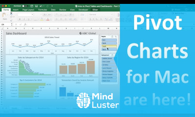
Pivot charts in excel course, in this course we will delve into the powerful world of Pivot Charts in Excel, an essential tool for dynamic data analysis and visualization. We will start by learning the basics of creating Pivot Tables, the foundation for any Pivot Chart. You'll discover how to convert these tables into interactive charts that make it easy to identify patterns, trends, and insights in your data. We will cover various types of Pivot Charts, such as bar, line, and pie charts, and teach you how to customize them to suit your specific needs. You’ll learn how to use filters, slicers, and drill-down features to manipulate your data on-the-fly, providing deeper analytical capabilities. Through practical examples and hands-on exercises, you’ll gain the skills to create and refine Pivot Charts, making your data presentations more impactful and easier to understand. By the end of this course, you will be proficient in using Pivot Charts to transform complex data into clear, actionable insights. Whether you’re a beginner or looking to enhance your Excel skills, this course offers valuable techniques and tips to elevate your data visualization capabilities. Join us to master Pivot Charts in Excel and unlock the full potential of your data.