Enhance your data visualization skills with the "Excel Charts Step by Step" online training course. Designed for individuals seeking to master professional skills in computer softwares, this comprehensive program provides step-by-step guidance to create impactful and insightful charts using Microsoft Excel. Whether you're a beginner or an intermediate user, this course ensures you gain practical knowledge to effectively communicate data and support decision-making processes.
Throughout this course, you will learn how to:
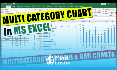
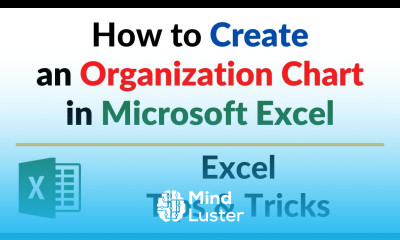
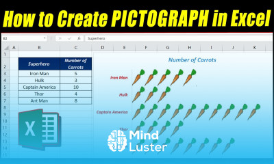
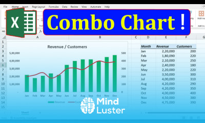
- Create various types of Excel charts, including bar, line, pie, and more
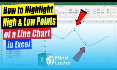
- Customize chart elements for clarity and visual appeal
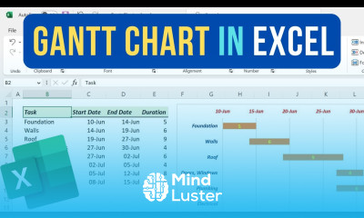
- Use advanced chart features to analyze complex datasets
- Incorporate charts into reports and presentations
- Improve your data storytelling skills for professional growth
This training course is ideal for professionals, students, analysts, and anyone looking to strengthen their data visualization capabilities. If you want to enhance your productivity, improve your employability, or advance your career in data management, this course offers the essential skills you need.
Why choose this course on our platform? We provide a trusted, certified course that combines practical exercises with expert guidance, ensuring you gain relevant skills that employers value. Our flexible online format allows you to learn at your own pace, making it accessible for busy professionals and students across the Middle East and beyond.
Completing this course opens doors to various career opportunities, including data analyst, business intelligence specialist, financial analyst, and reporting expert. Mastering Excel charts can significantly boost your professional profile and support your career growth in competitive job markets.
Upon successful completion, you will earn a recognized certificate, validating your expertise in Excel data visualization. This certification enhances your resume and demonstrates your commitment to professional development in computer softwares and data analysis. Enroll now to advance your skills and unlock new career possibilities in the Middle East, Saudi Arabia, UAE, and beyond. Ajay Anand