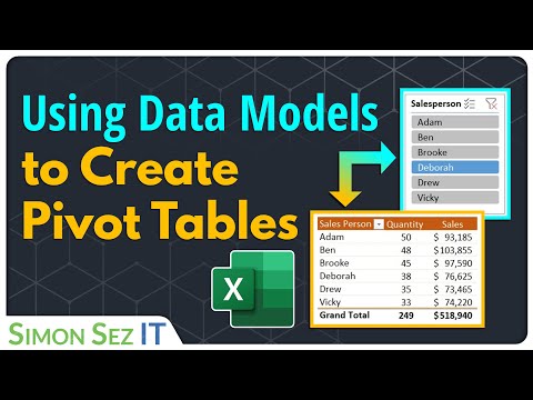
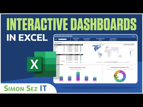
Creating an Interactive Dashboard in Excel Using Pivot Tables Pivot Charts and Slicers
Share your inquiries now with community members
Click Here
Sign up Now
Lesson extensions
Lessons List | 44
Lesson


Show More
Lessons
Comments
Our New Certified Courses Will Reach You in Our Telegram Channel
Join Our Telegram Channels to Get Best Free Courses
Join Now
We Appreciate Your Feedback
Be the First One Review This Course
0 Reviews
Related Courses in Computer Softwares


Course Description
Creating interactive dashboard in excel course,
in this course focuses on leveraging Excel's powerful features to design dynamic and user-friendly dashboards. Through step-by-step tutorials and hands-on exercises, you'll learn how to create interactive charts, graphs, and tables that allow users to explore data intuitively. Whether you're a data analyst, business professional, or Excel enthusiast, mastering interactive dashboard creation in Excel will enhance your ability to present insights and drive informed decision-making. Join us now to unlock the full potential of Excel for creating engaging and impactful dashboards.
Trends
MS Excel
Learning English Speaking
Python programming language
Daily conversational English
Microsoft Excel Basics
Java datatypes and variables
2D Animation Portfolio design for freelancing
Excel Course Basic to Advanced
Professional Makeup
Semiconductor Materials in Electronic Devices
iTB 3rd Annual Conference
Embedded Systems ES
Python typeCasting essentials for beginners
Photography
C Programming language basics For beginners
C Programming Language
Context switching In operating system
Affiliate marketing essentials for beginner
Text masking effect in photoshop for beginners
Java Programming Language
Recent
2D Animation Portfolio design for freelancing
Creating campaigns in google ads for beginners
Liquid Text Logo with after effects animation
After effects for text animation techniques
Creating pattern design in Illustrator for beginners
Character animation in after effects for beginners
Creating 3D typography in Illustrator for beginners
Text masking effect in photoshop for beginners
video intros in after effects for beginners
Logo design with after effects animation
Infographic animation in after effects techniques
Isometric animation in after effects for beginners
3D Shapes in after effects without Plugin
Cinema 4D Flower Vase design for beginners
Fingerprint animation in after effects for beginners
Creating 3D animations with android apps
Creating Kids cartoon video fundamentals
Mutual Funds fundamentals
Creating animated characters from scratch
Creating animated videos from scratch