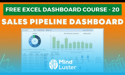
Excel Dashboard Course 14 Creating Bullet Chart in Excel
Share your inquiries now with community members
Click Here
Sign up Now
Lessons List | 21
Lesson
Comments
Related Courses in Computer Softwares
Course Description
Dashboards in Excel
An Excel dashboard is one-pager (mostly, but not always necessary) that helps managers and business leaders in tracking key KPIs or metrics and take a decision based on it. It contains charts/tables/views that are backed by data. A dashboard is often called a report, however, not all reports are dashboards.How do I create a dashboard in Excel?
Here's a step-by-step Excel dashboard tutorial:
How to Bring Data into Excel. Before creating dashboards in Excel, you need to import the data into Excel. ...
Set Up Your Excel Dashboard File. ...
Create a Table with Raw Data. ...
Analyze the Data. ...
Build the Dashboard. ...
Customize with Macros, Color, and More.How do you create a dashboard?
How to design and build a great dashboard
Be clear about what you're trying to achieve – your board's purpose will inform its design.
Only include what's important – everything should support your board's intent.
Use size and position to show hierarchy – make it clear to the viewer what's most important.How do I create a dynamic dashboard in Excel?
Create a dynamic Excel chart and make your own dashboard
Add a dynamic column to the data range using a HLOOKUP() function. This column will be the chart's real source, not the data range.
Insert a simple chart.
Add a scroll bar control that lets the user easily update the chart's source, without really knowing what's going on behind the scenes.
Trends
French
Formation efficace à l écoute de l
American english speaking practice
Artificial intelligence essentials
Gentle morning Yoga flow for beginners
Learning English Speaking
Designing Fonts in illustrator for beginners
Facebook ads account for beginners
Create a contact manager in excel
Data Science and Data Preparation
VBA macros in excel for beginners
Building a website with chatGPT
Real Estate Investing in New York
Reading and writing dates in french
Figma fast design techniques
laravel with JWT
Adobe Photoshop CC 2021
Essential english phrasal verbs
Magento Formation Français
Web Design for Beginners
Recent
Data Science and Data Preparation
Growing ginger at home
Gardening basics
Ancient watering techniques
Grow mushrooms
Growing onions
Veggie growing
Bean growing at home
Growing radishes
Tomato growing at home
Shallot growing
Growing kale in plastic bottles
Recycling plastic barrel
Recycling plastic bottles
Grow portulaca grandiflora flower
Growing vegetables
Growing lemon tree
Eggplant eggplants at home
zucchini farming
watermelon farming in pallets


